


Case study 01 · Homepage & conversion funnel, v1 to v3
The first version of the homepage was built to look credible. The second was built to convert. The third, still in progress, exists because credible and convertible turned out not to be the same problem once we started paying for traffic.
At a glance
v1 shipped with no product thinking behind it. v2 rebuilt the page around a real product vision, target customer, and KPIs I set myself, and applied the same trust logic to the Photographer Profile page. v3, still in progress, exists because most of our traffic doesn't actually land on the homepage anymore. Full GA4 conversion tracking broke the exact week v2 shipped, so this section is honest about what I can and can't actually prove.
A homepage with no plan behind it
SnapMatePhoto is two-sided: the homepage has to make a client trust an unfamiliar marketplace enough to book a stranger with a camera, and make a photographer believe the platform is worth signing up for. It's also the only page most first-time visitors see before deciding whether to keep going.
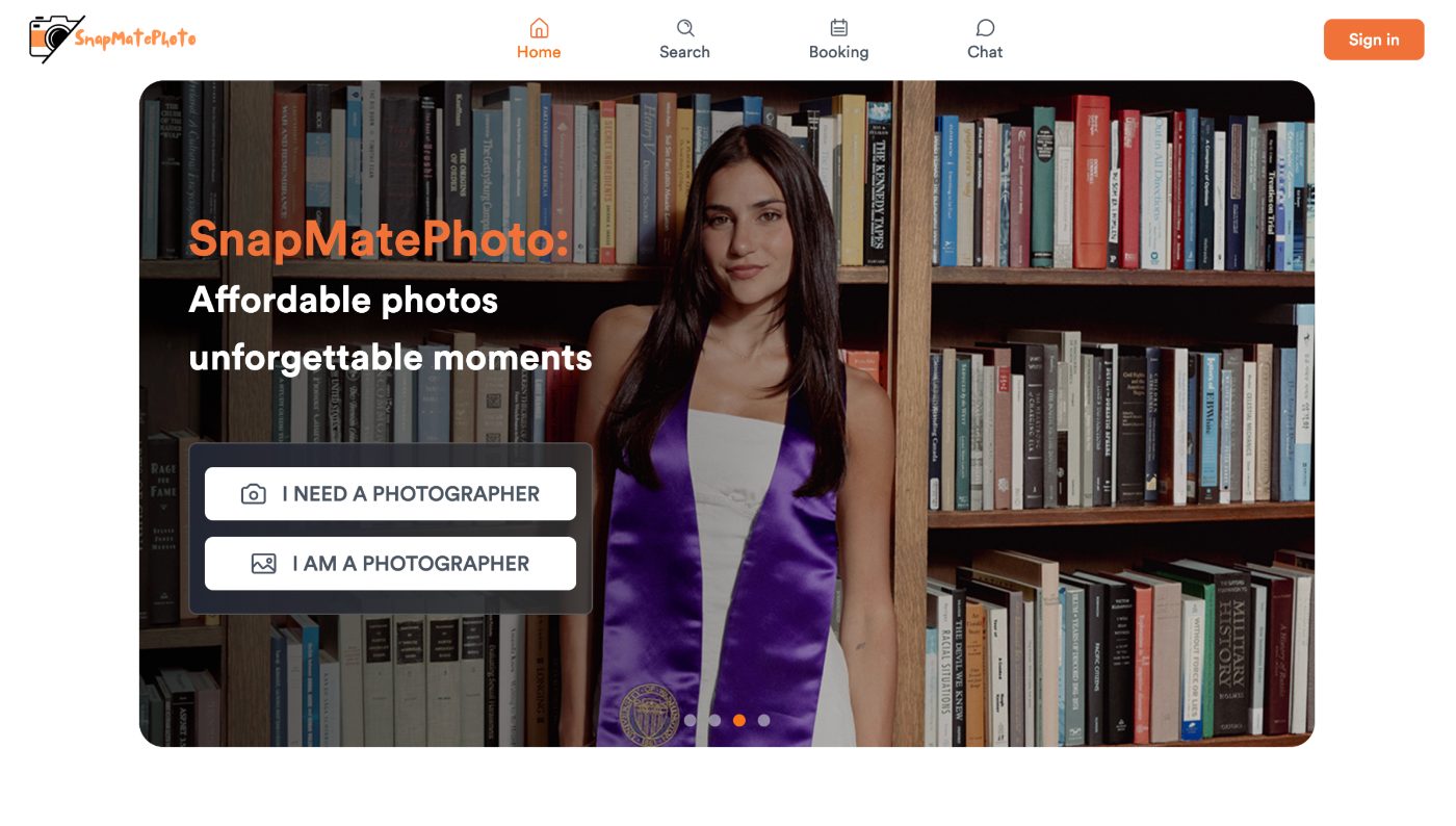
V1 shipped without a product plan behind it. An engineer the founder had hired built it in September 2025, the company's first weeks, before there was a product person or a PRD involved. It got the basics right, a clear split between the two user types, but it wasn't built against any read on what makes a marketplace homepage convert, and there was no data yet on how people were actually moving through it. That’s the gap I stepped in to close.
Setting a product vision before touching any UI
Before I touched layout, I wrote a one-page product vision for the homepage.
- The vision — make it easy for a first-time visitor to trust the platform and complete a booking smoothly, and make sure they'd come away describing SnapMatePhoto as affordable and reliable, the two words that were core to the brand.
- Who we were building for — amateur and part-time photographers looking for exposure and bookings, and a younger, Seattle-based client base who wanted photos that were more affordable and less intimidating to book than a traditional studio, without the complicated back-and-forth of DMing a photographer on Instagram who doesn't even list prices.
- Competitive position — honestly, we didn't have one yet. There was no single dominant player in affordable, on-demand photography (the closest comparisons were Airbnb-style photography add-ons, Flytographer, Snappr, and smaller studios like Unscripted), so establishing a clear identity fast mattered more than out-designing any one of them. That's a different problem than "make the homepage prettier," and it's the one I actually set out to solve.
KPIs, set against that vision so the redesign could be judged against something concrete
- A lift in the share of homepage visitors who complete a booking.
- A target click-through rate to "Book" or "View Photographer" in a visitor's first session.
- A qualitative check, a short exit survey, on whether visitors actually walked away describing the platform as affordable and reliable.
The first task I gave engineering wasn't a design change at all: instrument the site with GA4 so any of this could actually be measured, since none of it existed yet.
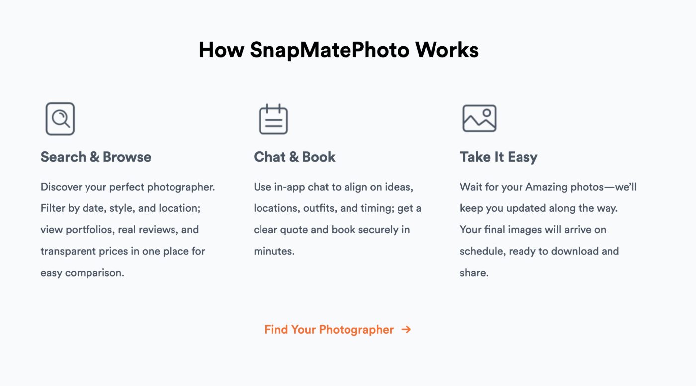
With the vision and targets set, I ran a structured teardown of direct and adjacent marketplaces (Airbnb, Upwork, Snappr, Thumbtack, Fiverr), plus a short first-time-visitor interview script (what's your first impression, what would you click first, what's missing before you'd book) to pressure-test the direction against real reactions instead of only competitor patterns. I kept only the patterns that repeated across most of the comps, not one-off style choices: clean, icon-free navigation that reduces noise around search, an early explanation of how the service works, real photos and testimonials instead of marketing copy, and trust signals shown early for a brand nobody had heard of yet.
What I changed, and why
Design and engineering time were both constrained, so I scoped this as a prioritized set of fixes rather than a full rebuild, and mapped each one to a specific hypothesis about where trust or clarity was breaking:
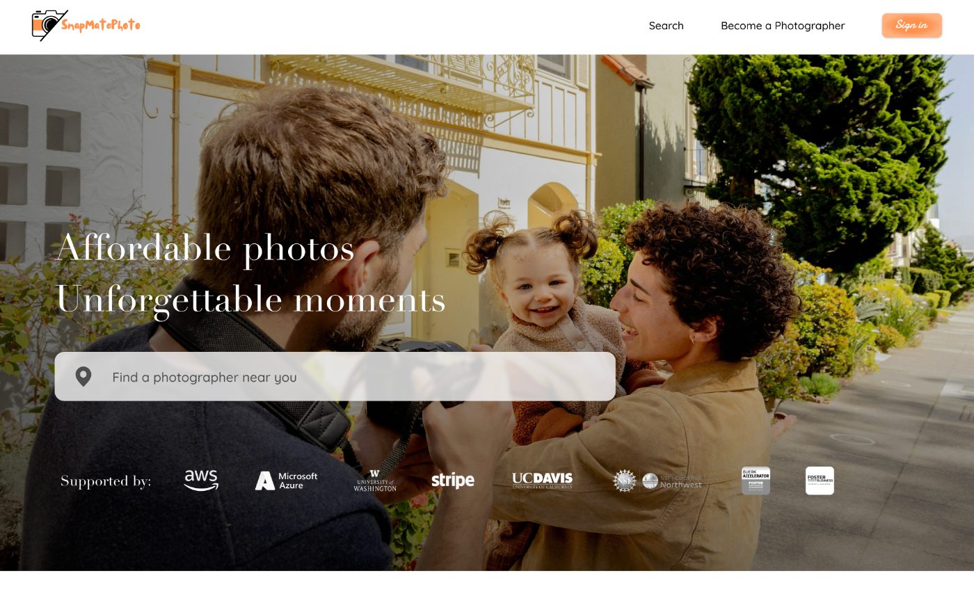
- HighNav bar. Two items were redundant (Home duplicated the logo, Booking duplicated Sign In) and added noise without adding a decision. Cutting them and reorganizing to Search / Explore / Chat, with Become a Photographer / Sign In on the right, made the one action that matters (search) easier to find.
- HighHero. The hero wasn't communicating what SnapMatePhoto actually does fast enough, and the slogan was competing for attention with a redundant wordmark. Rebuilt around a real photo, gave the slogan real visual weight, and added a location search bar as the primary action instead of a passive statement.
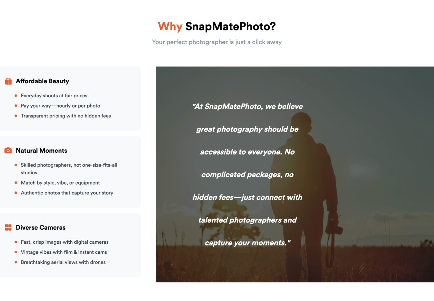
- HighTrust signals and social proof. Testimonials ("What Our Users Say") and the value proposition ("Why SnapMatePhoto") were split into two sections a visitor had to piece together themselves, and neither had a next action attached. Merged them into one section with a Book Now CTA under each testimonial, and added a "Supported by" row of program and partner logos to borrow credibility for a brand nobody recognizes yet.
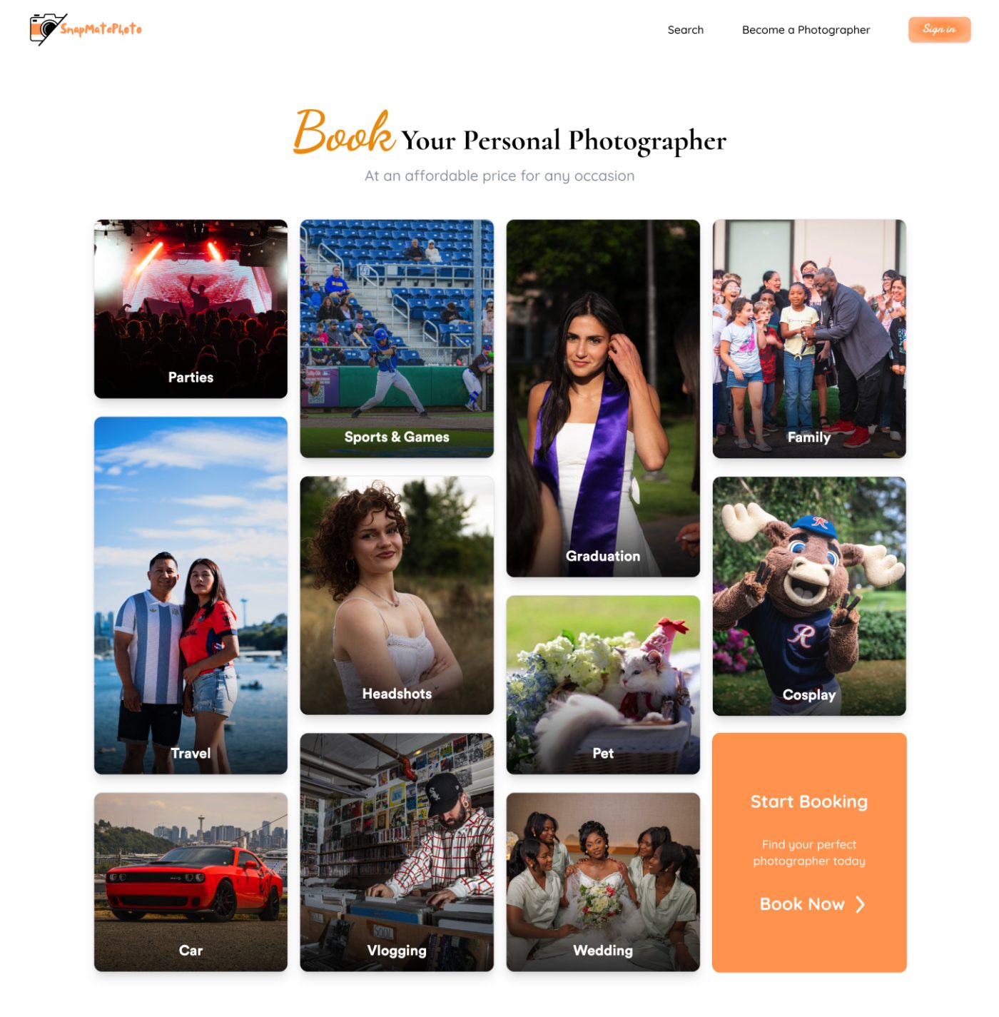
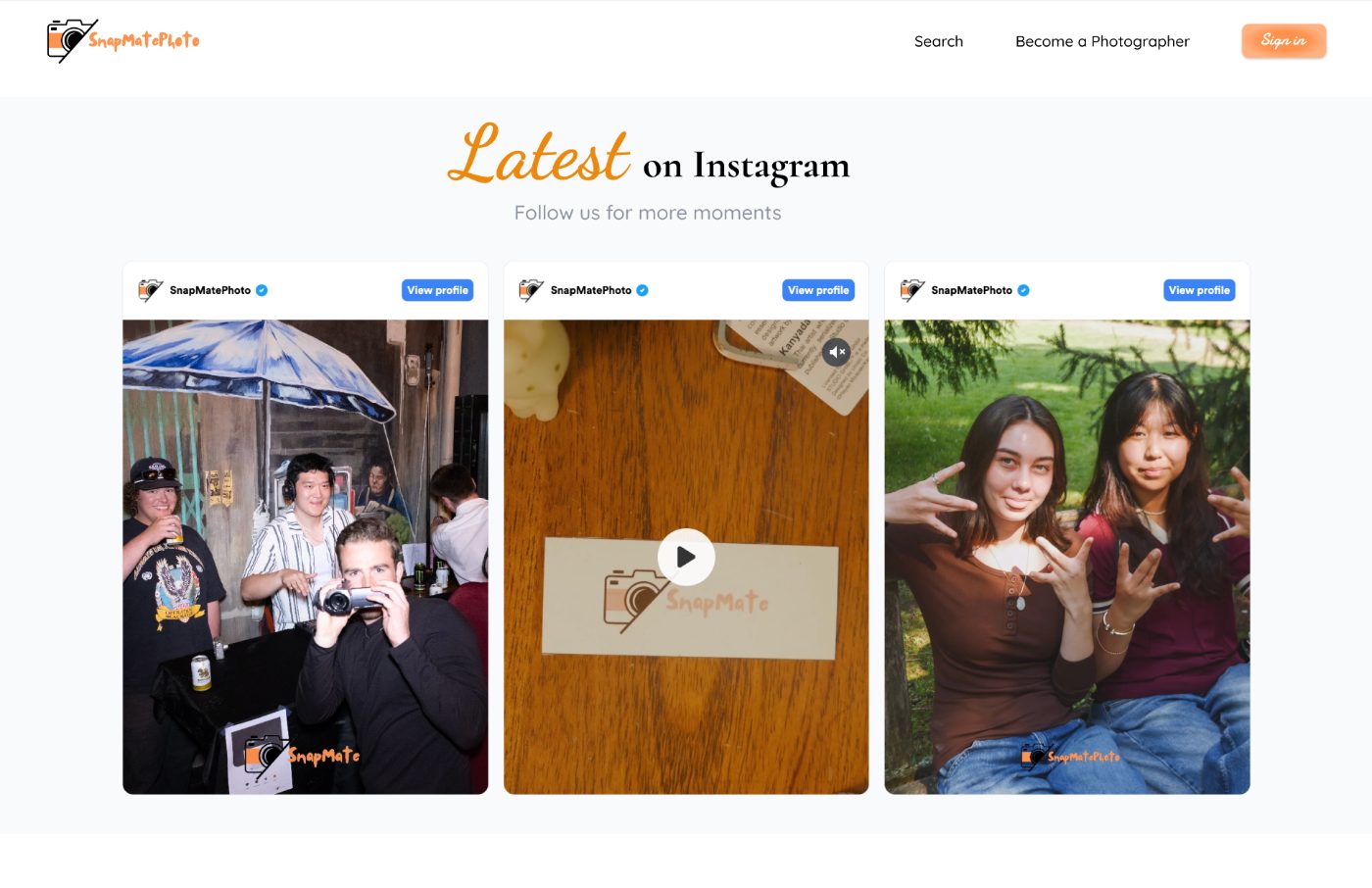
- MidKept as-is. The photo-category browsing grid and the Instagram feed were already doing their job, so I left them alone instead of redesigning things that weren't broken. Scoping what not to touch was as much a decision as scoping what to change.
- LowPage metadata. Fixed the page title tag to reflect the brand instead of a generic default. Cheap, low impact on its own, but it became the first piece of what turned into the SEO work in v3.
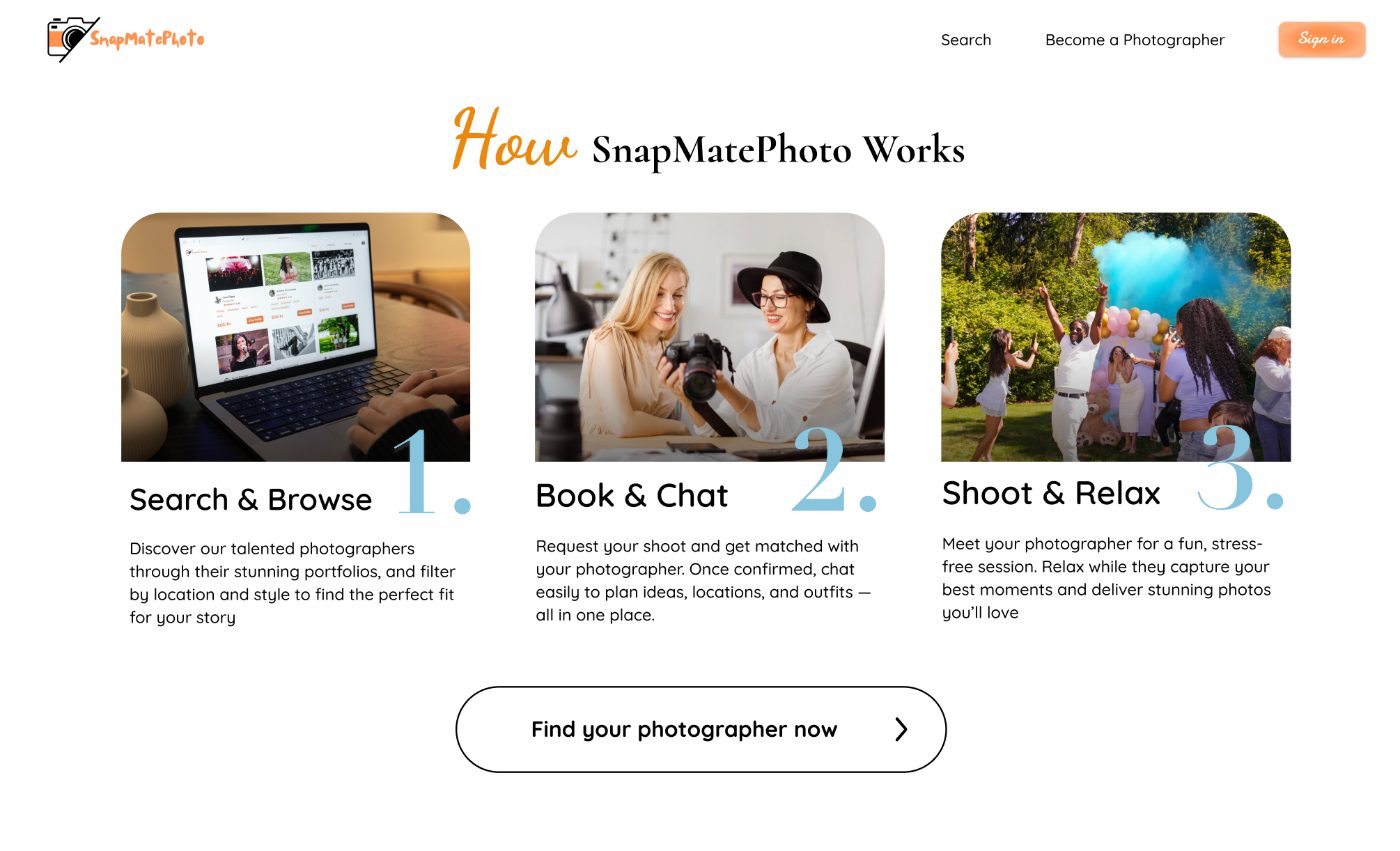
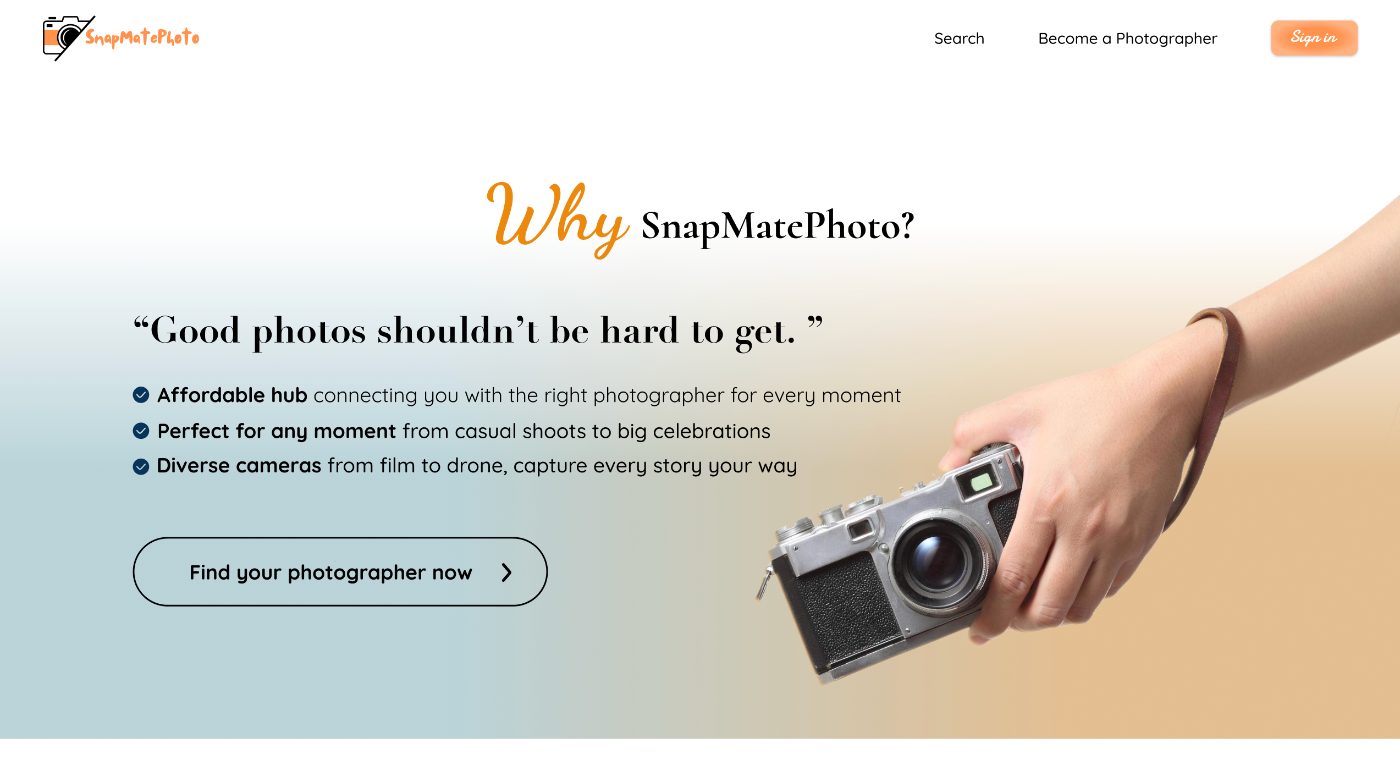
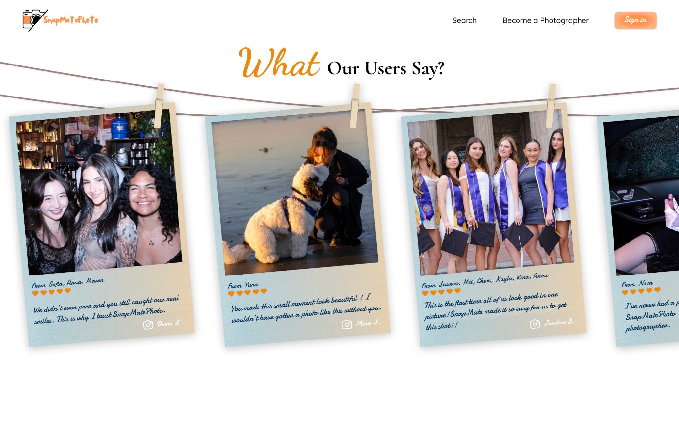
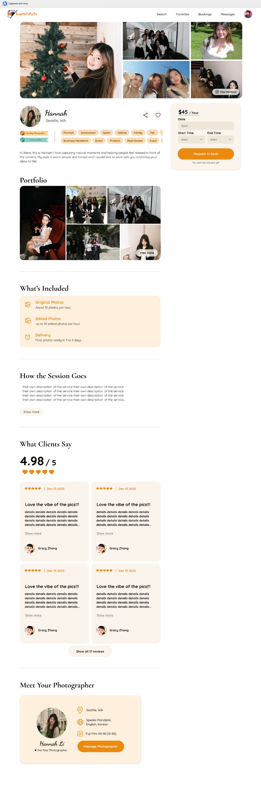
The real conversion page. The homepage's job is to get someone to a photographer's page. It isn’t where the decision happens. I applied the same trust framework to the Photographer Profile page: a hero and badge section (photo, rating, price, style tags, experience, personality) to establish trust fast, an About Me section for warmth, the portfolio itself to prove style fit, and price plus a CTA that's always the obvious next step.
Impact: what shipped, what broke, and what I can prove
The honest version of this section matters more than a clean number would.
What broke
v2 shipped May 26. The GA4 report for that exact week shows the conversion tracking that had been reliably counting bookings on the Photographer Details page (42 of them the week before) drop to zero, and it stayed at zero through the following two weekly reports too, flagged in GA4 itself as "almost always a tracking issue, not a real-world collapse." The redesign most likely changed enough of the page that the old tracking hook broke, and nobody reconfigured it for weeks afterward. That's on me to have caught sooner, and I'd rather say that here than cite a resume figure I can't back with data.
What I can point to instead. From the weeks after launch: even as raw sessions and users declined (mostly a pull-back in paid social spend, not the redesign itself), the visitors who stayed engaged more, not less.
36.4% → 40.2%
Engagement rate, week over week
+22.6%
Average engagement time
31 → 41
Sign-ups in a single week, a 32% jump, all while the overall audience shrank
8
Photographer sign-ups, the first working read on that event, with no earlier baseline to compare against
That's a smaller, better-converting audience, which is the direction a redesign focused on trust and clarity should move things, even without a clean conversion number to prove it caused the move.
On the resume numbers. The 35% and 20% figures on my resume describe this redesign's impact in shorthand. I'm not comfortable stating them as precise, sourced numbers in a case study until I either fix the gap in GA4's key-event tracking and get a real before/after window, or pull raw booking and sign-up counts directly from the backend, which sidesteps the tracking gap entirely.
v3: a different problem entirely
v2 solved for a visitor who lands cold on the homepage and clicks through it in order. That’s not who most of our traffic actually is. As we ran paid marketing campaigns, most of that traffic goes straight to the Photographer Profile / Search page. The homepage isn't the entry point for a warm, campaign-driven visitor the way it is for organic or brand traffic. Two problems followed from that:
- The homepage hero doesn't answer "what is this, fast" clearly enough for someone arriving cold from search rather than a campaign, and the page has weak SEO, so searching for "SnapMatePhoto" or "affordable photographer [city]" doesn't reliably surface us.
- As we plan to expand into new cities (LA, NY), the homepage has no city-specific landing experience, and the photographer-side entry point ("Become a Photographer") isn't strong enough for a two-sided marketplace that needs to grow supply as fast as demand.
I wrote the v3 design-direction PRD as a draft for discussion, not a build spec, since this was exactly the kind of decision that benefits from team alignment before anyone commits engineering time to it.
Context: the current landing page was built for a single city, Seattle. We're now live in Seattle and LA, expanding further, and bringing real photographer portfolios onto the platform. The page hasn't caught up: search isn't the focal action, there's no way to browse by city or session type (which matters for SEO), and there's no entry point for photographers at all.
Goals: make search the primary, unmistakable action on the page; show real photographer work early to build trust before someone starts browsing; build city and session-type browse pages that drive SEO; create a photographer entry point without blocking on the not-yet-designed photographer landing page.
The clearest tradeoff: how to surface real photographer work
I recommended the curated option, not the personalized one, for now. Forcing a "top 3 cities" layout undercuts the SEO and breadth story we're trying to tell with only two cities live, and the geolocation build isn't justified until there's enough city and photographer density for "photographers near me" to mean anything. Right now, portfolio quality is the trust signal that matters, not proximity. I flagged the personalized option to revisit once that density exists, instead of building it now on the assumption it eventually will.
What's locked in since the first draft of this PRD
- The hero keeps real photographer photos rotating behind the search bar, rather than moving to a fully clean, image-free layout. First impressions are still emotional before they're functional, and real work from our own photographers reads better than an empty search box ever will.
- Pricing shows per photographer card, not one "starting at" figure for the whole section, since price genuinely varies by city and session type and a single number would undersell some photographers and mislead about others.
- Section 4's photographer entry point sits after Section 3 and before the footer, the placement a secondary CTA is expected to occupy.
- Section 3's browse structure (modeled on Peerspace: "Wedding photographer in Seattle," "Graduation photographer in Seattle") launches with the session types we already have real portfolio content for: parties, sports and games, graduations, family sessions, travel, business headshots, cosplay, pet photography, car photography, vlogging, and weddings. That gives the SEO pages real work behind them from day one instead of empty categories waiting to be filled.
Success metrics, since this redesign is about search visibility and trust rather than raw traffic
- Search-bar engagement rate on the new hero.
- Organic sessions landing on the Section 3 city and session-type pages, and their click-through rate into a photographer profile.
- Click rate on the Section 4 photographer entry point, to validate photographer-side demand before the full photographer landing page gets built.
Reflection
v1 to v2 was about closing a vision gap: putting a real product vision, target customer, and KPIs behind a page that had shipped without any of that. v2 to v3 is closing a different gap entirely, between the traffic we designed for and the traffic we actually pay for, and between a single-city product and a multi-city business.
The part I'd actually flag as growth, though, isn't either redesign. It's catching, late, that the metric I was supposed to be improving broke the same week the redesign shipped, and choosing to say that plainly here instead of pointing at a resume number I can't stand behind. A case study is more convincing when the person telling it will admit what they don’t know yet than when every number lines up too cleanly.
Case study 02 · Availability & booking flow system
Photographers were losing bookings two different ways at once: turning down clients they were actually free for, because their availability wasn't visible or current, and holding a slot for a client who might never pay, while another paying client got turned away for the same window. Closing both gaps meant redesigning what a time slot means on the platform, not just adding a calendar.
Status: the availability and booking logic is live. The photographer-facing frontend is in active build now, aligned to it.
At a glance
Photographers were losing bookings to stale calendars and double-booked slots; clients were getting rejected and often not coming back. I designed an availability system that defaults open instead of handing photographers a blank calendar to fill in, scoped out a client-first filtering idea that looked better on paper than it would have worked in practice, and moved slot-locking from payment to acceptance to close a real double-booking gap a photographer raised directly. Separately, I'm running early, lower-risk experiments on the client-side half of this same problem.
Problem
Two sides of the same visibility gap:
- Photographers kept receiving requests for times they were already booked, and had to manually reject each one.
- Clients got rejected for unavailable slots and, after one rejection, often didn’t try again. Some told us directly they only want to see available options.
Neither side had a shared, trustworthy view of availability, and that's a harder problem on SMP specifically than it sounds. Most of our photographers are student photographers or semi-professional photographers working other jobs, not full-time studios. Photography isn't the first thing they check every morning, so a system that depends on them remembering to keep a calendar updated is fighting their actual habits, not just a UI gap.
Research: what I looked at, and why none of it fit as-is
I looked at more models than these three, but three shaped the actual decision:
I also looked at When I Work, a shift-scheduling tool built for hourly teams. It's a different context, one employer scheduling many employees, not many independent suppliers meeting many independent buyers, but one design instinct carried over directly: default toward the maximum bookable time, and only ask the person to input restrictions, not their whole schedule from a blank slate. That's the opposite of handing someone an empty calendar to fill in themselves, and it matched what our photographers actually needed given how little spare time they have to spend maintaining a listing.
None of the three main comps fit SMP's actual shape: a semi-flexible service marketplace, where clients have a preferred time and duration, photographers have availability that isn't always current, and some negotiation is expected.
This research ran alongside the same interviews behind the Bookings Dashboard case study, not as a separate round. I asked Kevin, Gerald, Kaylee, and Ashitha about both availability and dashboard visibility in the same conversations, since for a photographer they're really one problem: not knowing what's coming up, and not trusting what the platform says is available.
Kevin's rawest comment on this shaped the default-open decision directly: he wanted to be able to block out about two months at a time, not commit further out than that, and he wanted big jobs like weddings to be able to bypass his own availability settings entirely, since he'd rearrange his schedule for one of those regardless of what he'd marked open.
That's most of the reason the system ended up leaning toward maximum flexibility by default instead of asking photographers to declare every open hour themselves.
The booking flow: what the client sees
Duration first, then date, then a start time that's either a system-suggested slot based on availability or a manual entry, with the end time auto-calculated from duration. This keeps the guidance of a slot-based system without the rigidity of one, and keeps engineering scope bounded: no need for strict real-time enforcement everywhere, just validation on top of simple availability data.
The debate: build more, or scope less
The real disagreement wasn't about UI paths. It was about whether to flip the booking model entirely: have the client state their desired session time first, then only show them photographers who'd already declared themselves available for it. It's the more obviously-right version of an availability system on paper, and we spent real time on it before deciding not to build it.
Why we didn't build it
- 1. We had no confidence the data behind it would be trustworthy. Even if a photographer keeps their calendar updated, "available" on a screen doesn't guarantee actually available. People's lives change. If a client filtered down to a photographer who looked available and then got rejected anyway, that's a worse experience than what we have now, not a better one. It trades a rejection the client expects, before they've invested anything, for one that arrives after they think they've already found their match.
- 2. Kevin's own behavior argued against it directly. He might turn down a short, lower-paying session if the timing is inconvenient, but he'd rearrange his whole week for something like a wedding. If we filtered strictly on declared availability, a wedding inquiry that happened to fall outside his stated hours would never reach him at all, even though it's exactly the booking he'd want. Strict filtering doesn’t just avoid bad matches, it can silently kill the best ones.
What we did instead: rather than building a system that tries to model when a photographer would break their own stated availability, a genuinely hard problem, we scoped it down to a simple threshold. After a client specifies session length, if it's longer than 4 hours, a message tells them to contact SnapMatePhoto support directly instead of continuing through the standard flow. Short, typical sessions stay fast and self-serve. Long sessions, weddings especially, get routed to an actual conversation instead of a filter that would have quietly excluded them.
The photographer side: leaning open by default
The system leans open, not locked, because the goal is to maximize bookable time:
- Default is fully open. Every future date is available unless the photographer explicitly restricts it. A photographer who sets nothing is bookable anytime.
- A photographer can add more than one time block per day (for example 9 to 11 AM and 4 to 8 PM), and copy a day's pattern to all future dates in one action.
- A photographer can scope availability to a specific date range (minimum one week) if that's more useful than open-ended; outside that range, dates stay open by default.
- A settable buffer between bookings, and a minimum 24-hour booking notice for clients.
- Bookings start at 1 hour and extend in 30-minute increments, shown in the photographer's local timezone.
- Accepting a request locks that slot and removes it from availability. If it's not paid and gets cancelled, expires, or is declined, the slot reopens automatically. Once paid and confirmed, the slot stays locked.
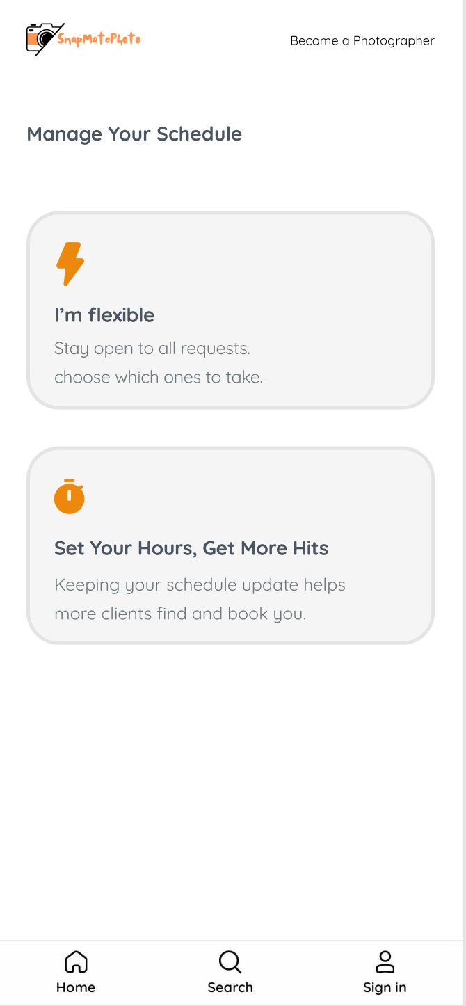
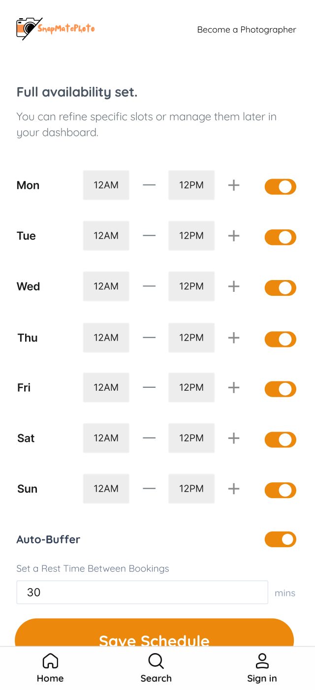
Each frame scrolls in place.
Why this lives in onboarding, and why we almost didn't build it
The harder decision wasn't the mechanics above. It was whether to require availability at all, and where.
Our photographer sign-up flow had been made deliberately easy, on purpose, to grow the photographer pool fast in the platform's early weeks. It worked, but it had a side effect: a lot of photographers weren't paying much attention to the platform after they signed up. They'd ignore booking request notifications and effectively forget they were live and bookable on the site. Adding a short availability step to sign-up wasn't only about collecting scheduling data. It was about making a new photographer engage with the platform seriously at the one moment we actually had their attention.
Sky, Bea, and I had a real, extended debate about whether to do this at all, because it cuts against two things we cared about:
- 1. If photographers set availability once and never touch it again, it goes stale fast, and a stale calendar is worse than none: it can actively block a client's request during hours the photographer is actually free.
- 2. As a business, if photographers set narrow availability, which is the likely behavior for someone rushing through onboarding, clients have a harder time booking the photographer they actually want. That works directly against growth.
I pushed to build it anyway. The GA4 funnel had already shown real softness somewhere after a photographer said yes to a request, and what photographers told us directly, Kevin manually cross-checking a personal calendar, the double-booking risk Ashitha raised, made a strong enough case on its own without needing to prove a direct line to that specific number.
The compromise: build it, but don't push it hard. New photographers see it as a required but lightweight step during sign-up. Existing photographers who might not know it exists can find and adjust it from the bottom of the dashboard if they choose to, so we're not retroactively restricting a supply pool we'd spent real effort building.
The fix Ashitha's interview actually drove
Ashitha surfaced the sharpest version of the risk in the second interview round: during the payment-pending window, a slot she'd already accepted could still be requested by someone else. She was potentially holding a slot for a non-paying client while turning away one who might commit.
Before
Slot locks when the client pays.
After
Slot locks the moment the photographer accepts.
It's a small rule change with a real consequence: a photographer’s word now holds a slot on its own, the same way a completed payment does, at least for scheduling purposes.
The client side, in parallel
Fixing the photographer side first wasn't a decision to ignore the 17% payment gap. It was about which problem we actually understood well enough to fix. The photographer-side complaints came with a clear cause attached: stale calendars, manual rejects, a slot held for a client who might not pay. The client-side number was just as real, but we didn't have the same clarity on why a client accepts a photographer and then doesn't pay. Price hesitation, second thoughts, simply forgetting inside a 48-hour window, we had a number, not a cause. Shipping a bigger fix into that uncertainty felt like guessing, so the side where the cause was already validated went first.
That doesn't mean the client side sat untouched. The payment window runs 48 hours on both ends of a request: 48 hours for a photographer to accept, then another 48 hours for the client to pay once they do. Until recently, a client only heard from us once, at the start of that second window. We added two more touchpoints inside it: an email at 12 hours left ("Just 12 hours left to pay and lock in {photographer} for {date}") and another at 6 hours left. Both are small, reversible changes, the kind of thing worth trying before committing to a bigger client-side rebuild. Booking volume has been low this stretch of the off-season, so I don't have enough data yet to say whether they're actually moving the payment completion rate, and I'd rather wait for a real read than claim one now.
What's next, if the pattern holds: an embedded feedback prompt when a booking gets cancelled or a payment window expires, so we finally get a cause on the client side the same way the interviews gave us one on the photographer side, instead of continuing to guess at it. SMS is also worth testing alongside email, given how mobile-heavy this audience already is (close to 90% of sessions are on mobile, mostly Safari, per GA4). And a simple internal flag on bookings that are close to expiring unpaid, so the team can reach out directly instead of relying on the client to act on an email, is the kind of low-build-cost idea that fits the same pattern as the reminders above.
Reflection
This ended up being less about calendar mechanics and more about a business tradeoff between data quality and growth, argued out loud with the founder and designer instead of assumed. I was the one pushing to add friction to onboarding, which isn't the instinct I'd have guessed I'd have a year into this job. The easy version of good product instincts is "reduce friction everywhere." The real version is knowing which specific piece of friction is actually protecting something you can’t get back once it’s gone, in this case, a new photographer's attention.
Case study 03 · Upcoming bookings dashboard
The instinct was a full calendar view. I scoped it down to a list sorted by date, which solves finding what's next without a calendar's engineering cost.
At a glance
Photographers had no reliable way to see what booking was coming up next, on a page that hadn't been redesigned since early on and hadn't kept pace with everything else we'd shipped. I scoped the fix down from a full calendar to a simple date-sorted list, validated it across two rounds of interviews, and it's now part of a larger process spec the team is actively building against.
Problem
Photographers had no way to see what was coming up next. The dashboard listed every booking (new requests, canceled sessions, completed sessions) in one unsorted feed. Kevin, who now takes multiple sessions a day, described having to scroll through each one individually while manually cross-checking against his personal Google Calendar just to know what was next. As booking volume grows, that's a reliability risk: double-commitments and unprepared arrivals.
A few other things pushed this up the list around the same time, not just Kevin's complaint:
- It was the last page on the platform still running the old visual system, everything else had already moved to the redesign by that point, and the gap was starting to be visible.
- We'd also added a number of new features to booking management since the dashboard was first built, new statuses, note fields, the availability changes above, and the old flat, unsorted list had no real way to represent any of it.
- It wasn't only photographers losing track of what was coming up: a couple of them separately mentioned clients forgetting about an upcoming booking too, which pointed at the same root problem, no clear, ordered view of what's actually next, showing up on more than one side of the same page.
Research
I interviewed two photographers first (Kevin and Gerald) and mapped every pain point they raised into an impact/effort matrix. Of thirteen distinct issues, only four landed in Tier 1 (do first): high impact, low-to-medium effort. "No easy way to see upcoming bookings" was one of them, tied directly to a workaround Kevin was already running.
A second round, with Kaylee and Ashitha, was for validating the fix before it locked in, not just collecting more opinions, and covered both this dashboard work and the availability system in Case Study 02 in the same conversations. Across all four interviews, a clear pattern emerged:
Dashboard visibility stayed a Kevin-specific signal even after four interviews, but a related, previously fuzzy complaint got sharpened into something actionable: Ashitha couldn’t tell whether a booking was waiting on her response or waiting on the client’s payment.
What I scoped out, and why
The instinct was to build a full calendar view. I scoped that down:
- A list view sorted by date solves the actual problem (finding what's next) without the engineering cost of a full calendar.
- Full calendar view and Google Calendar / .ics sync became separate, later-priority PRDs, so they don't block this one. The availability system in Case Study 02 covers part of this.
- Color-coded booking status (Kevin's suggestion) got deferred until a calendar view exists, since it's more useful in that context.
- Double-booking prevention and session reminders were scoped out entirely, separate pain points, separate PRDs (double-booking prevention is now covered by the availability system in Case Study 02).
The harder open question: should unpaid, accepted bookings show in the "Upcoming" view at all? Hiding them risks a photographer forgetting to follow up. Showing them risks implying a booking is confirmed when it isn't. I left this open in the PRD instead of guessing, since it connects to the two-day payment window problem, which needed its own decision first.
What shipped
The PRD specifies:
- "Upcoming" is the default view on dashboard load, not "All."
- Bookings sorted by session date and time, ascending.
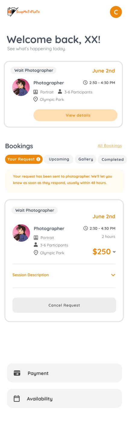
- Each card shows client name, date/time, location, photography type, group size, and a status tag.
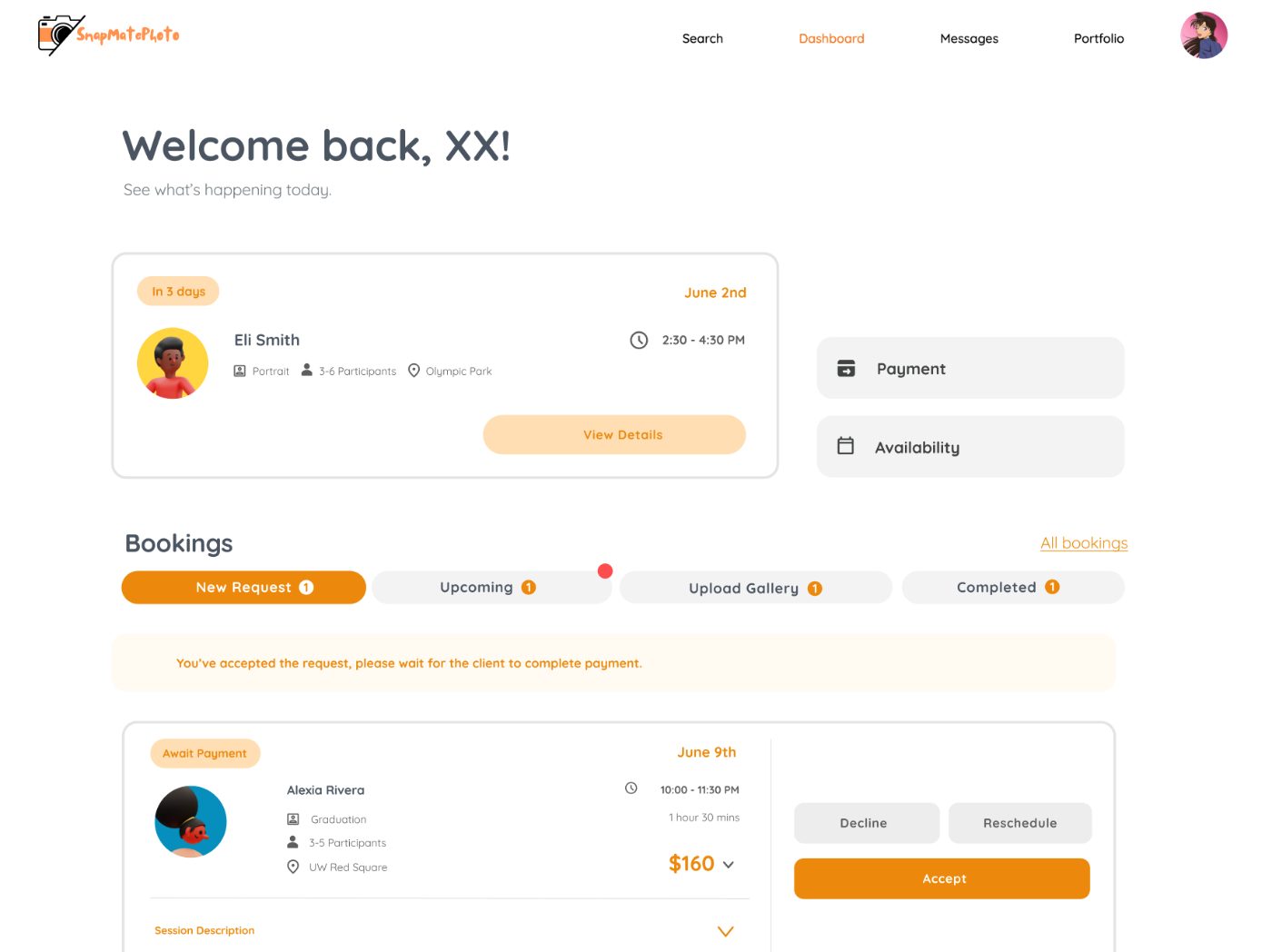
- Ashitha's interview gave that status tag a concrete fix: split one ambiguous status into two explicit states, waiting for your response and waiting for client payment.
- Nice-to-haves, not required for v1: a count on the dashboard summary, and a highlight for sessions within 48 hours.
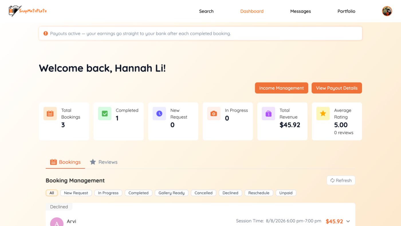
Since this PRD, the dashboard design has moved further, into a full process spec the team is building against. Bookings now live across four tabs (New Request, Upcoming, Upload Gallery, Completed) plus an All Bookings archive for full history, and Ashitha's status-clarity fix became two literal statuses, Action Required and Waiting Client Payment, both inside New Request. A two-signal badge system separates "how many" (a persistent count) from "what's new" (a temporary dot that clears once the photographer has looked), so a photographer can tell their normal queue apart from something that just changed at a glance.
Impact
This is in active build now, against a process spec the team aligned on in July. The success criteria below were set before build started, not backfilled after:
- A photographer can find their next session within 5 seconds of opening the dashboard, without scrolling.
- A measurable drop in scheduling-confusion complaints (baseline still needs to be established pre-launch).
- Qualitative confirmation in follow-up interviews that the dashboard feels more manageable.
Reflection
This PRD started from two interviews. A second round with Kaylee and Ashitha gave a mixed result: dashboard visibility stayed a single-photographer signal, while a related-sounding complaint, not knowing whose turn it is to act, was independently confirmed by Ashitha and needed a different fix than the one first proposed. Kevin had suggested color-coded status tags; what actually solved Ashitha's version was splitting a single ambiguous state into two explicit ones.
That's what a second round is for: checking the fix before scope locks, not just gathering more opinions. Across both rounds and some lighter check-ins with other photographers, this represents about 15 separate conversations feeding into the SMP backlog. Not all of them full interviews, but each one either confirming or breaking an assumption before it shipped.